- Forums
- Product Forums
- General Purpose MicrocontrollersGeneral Purpose Microcontrollers
- i.MX Forumsi.MX Forums
- QorIQ Processing PlatformsQorIQ Processing Platforms
- Identification and SecurityIdentification and Security
- Power ManagementPower Management
- Wireless ConnectivityWireless Connectivity
- RFID / NFCRFID / NFC
- Advanced AnalogAdvanced Analog
- MCX Microcontrollers
- S32G
- S32K
- S32V
- MPC5xxx
- Other NXP Products
- S12 / MagniV Microcontrollers
- Powertrain and Electrification Analog Drivers
- Sensors
- Vybrid Processors
- Digital Signal Controllers
- 8-bit Microcontrollers
- ColdFire/68K Microcontrollers and Processors
- PowerQUICC Processors
- OSBDM and TBDML
- S32M
- S32Z/E
-
- Solution Forums
- Software Forums
- MCUXpresso Software and ToolsMCUXpresso Software and Tools
- CodeWarriorCodeWarrior
- MQX Software SolutionsMQX Software Solutions
- Model-Based Design Toolbox (MBDT)Model-Based Design Toolbox (MBDT)
- FreeMASTER
- eIQ Machine Learning Software
- Embedded Software and Tools Clinic
- S32 SDK
- S32 Design Studio
- GUI Guider
- Zephyr Project
- Voice Technology
- Application Software Packs
- Secure Provisioning SDK (SPSDK)
- Processor Expert Software
- Generative AI & LLMs
-
- Topics
- Mobile Robotics - Drones and RoversMobile Robotics - Drones and Rovers
- NXP Training ContentNXP Training Content
- University ProgramsUniversity Programs
- Rapid IoT
- NXP Designs
- SafeAssure-Community
- OSS Security & Maintenance
- Using Our Community
-
- Cloud Lab Forums
-
- Knowledge Bases
- ARM Microcontrollers
- i.MX Processors
- Identification and Security
- Model-Based Design Toolbox (MBDT)
- QorIQ Processing Platforms
- S32 Automotive Processing Platform
- Wireless Connectivity
- CodeWarrior
- MCUXpresso Suite of Software and Tools
- MQX Software Solutions
- RFID / NFC
- Advanced Analog
-
- NXP Tech Blogs
- Home
- :
- ARM Microcontrollers
- :
- LPC Microcontrollers Knowledge Base
- :
- [Tool] Step By Step Guider of using GUI-Guider
[Tool] Step By Step Guider of using GUI-Guider
- Subscribe to RSS Feed
- Mark as New
- Mark as Read
- Bookmark
- Subscribe
- Printer Friendly Page
- Report Inappropriate Content
[Tool] Step By Step Guider of using GUI-Guider
[Tool] Step By Step Guider of using GUI-Guider
As a free and open-source graphics library, LVGL provides great convenience for related series of chips in creating animations, building advanced graphics and building various blocks. LVGL has been integrated into the MCUXpresso SDK package, which can be imported either through the SDK download or directly in the GUI Guider.
GUI-Guider is a ready-to-use GUI from NXP. On the basis of being free for NXP equipment, it has a series of advantages such as convenient operation, automatic programming, Chinese and English interface and input.
The following takes the LPC54S018 development board as an example, by creating a simple UI interface, to let everyone familiar with its basic operation process and usage.
- Create new project
Select V8 lvgl version, LPC54S018 development board, EmptyUI, set the name and path, click Finish
- Set the overall background
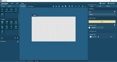
Drag Widget Tab to the GUI Editor, and resize it to full screen size.
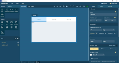
Fig.2
- Add time display and to-do functions.
1) Change the Tab Content1 name to Clock in the red box on the right.
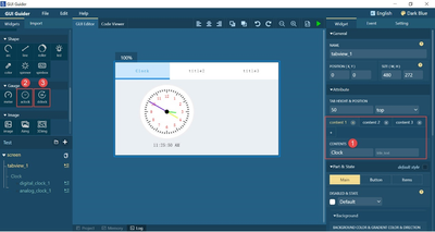
Fig.3
2) Drag aclock into editor, adjust its size and position, and set the time according to the red box in Figure 4.

Fig.4
3) Drag the dclock clock into the editor, adjust its size and position, and set the time according to the red box in Figure 5.
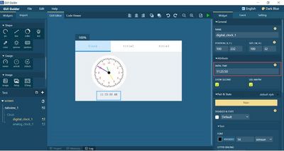
Fig.5
4) Drag the checkbox into editor, adjust its size and position, and edit its content according to Figure 6.
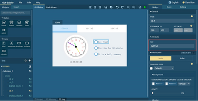
Fig.6
- In the second Tab content, add a simple counting function and set the progress bar to interact with it.
1) Add a background. Click Import to import the background image, in the widget, drag the image into the editor, set the size and position, select the imported image in the image path and set its transparency, as shown in Figure 7.
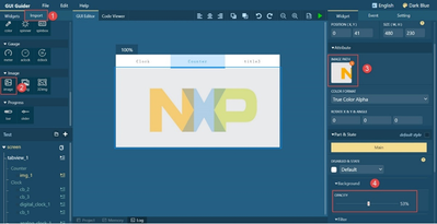
Fig.7
2) Add count value, progress bar and button. Figures 8, 9 and 10.
In Figure 8, when adding a progress bar, set the starting value in the second step. The range value of the progress bar is set by lv_bar_set_range(guider_ui.screen_progress_bar, 0, 100) which can be added to a key event, executing on every click. Therefore, it is recommended to add this code to the subsequent export file costomer.c, and set it once during initialization.
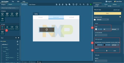
Fig.8
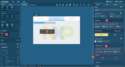
Fig.9
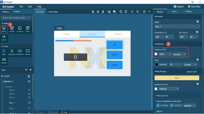
Fig.10
3) Add some explanatory text to the progress bar. The operation steps are shown in Figure 11.
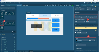
Fig.11
4) Create an event in the corresponding button, select Customer Code, write the corresponding code, and complete the interaction. Take the ADD button as an example, as shown in Figure 12.
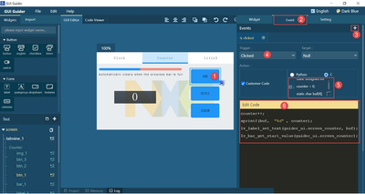
Fig.12
- In the Tab third content, 3D animation effect is shown.
1) Set the 3D picture. Select 3Dimg, drag it into the editor, set the image in the image path, and then select the rotation center and rotation angle, as shown in Figure 13.

Fig.13
2) Set the display switch. Turn on the switch to display the 3D picture, and when the switch is turned off, the picture disappears. Such as Figure 14.
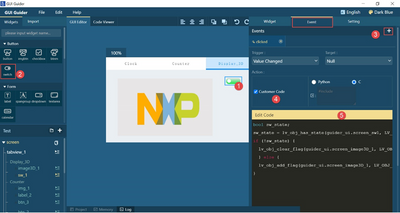
Fig.14
- In the fourth Tab content, add “help”.
1) Add logo. Add img, import image to set transparency.

Fig.15
2) List the first three modules. Drag the list Widget into the editor, create new lines and modify pictures and texts.
After completion, generate the code as shown in Figure 16. The results can be directly displayed by simulation or imported into the development board. Figure 17 shows the simulator and selectable target. The simulation results are shown in Figure 18.
There are two ways to download the design to the development board. One is to select the available IDE in Figure 17 and download it directly through GUI Guider. The second is to export the source files first, replace them one by one in the relevant SDK demo code, build with application code in IDE and download/debug with IDE debugger.
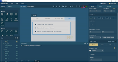
Fig.16
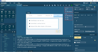
Fig.17

Fig.18
Video Class : https://www.youtube.com/watch?v=QM52Nu16zKQ